Getting a Sense of the Data
Understand the data set provided in the previous lesson.
To get a sense of the data, let’s draw a stacked bar chart by status:
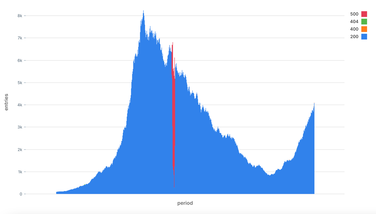
Entries across the duration of data collection
The chart shows a period of 12 hours. It looks like we have a nice trend with two peaks at around 09:30 and again at 18:00.
We can notice right away that at around 11:30, there was a significant increase in 500 status code errors. The burst died down after around 10 minutes. This is the type of anomalies we want to identify early on.
It is entirely possible that there were other problems during that time; we can’t spot them with a naked eye.
Quiz 1
Preparing the Data
Mark as Completed
Report an Issue
